This project was a submission to the 2020 Brand X Challenge and won 2nd place of over 500 submissions. The campaign was designed to go beyond the brick and mortar by bringing the widely loved makeup retailer, Sephora, on the road for their “Fearless Tour.” The installation is a 40’ x40’ activation and social media playground that creates an immersive experience for all beauty lovers with a mission: to champion all beauty, live with courage, and stand fearlessly together to celebrate our differences.
DATE - SPRING 2020
PROJECT TYPE - INSTALLATION AND BRANDING
PARTNERS - MIA DIMAIO, EMILY LIN
software used - rhino, adobe suite
BRAND X CHALLENGE NATIONAL STUDENT COMPETITION 2ND PLACE WINNER
(media coverage here: https://www.eventmarketer.com/interactive-content/2020-brand-x-challenge/)
THE WINDOWS AND MIRRORS MANIFESTO
Windows and Mirrors is a call to action. It’s a space for us to find and talk about how empathy can make a difference. We must always hold in our minds both windows and mirrors. One a portal for us to learn about the experience of others, and the second a means for us to understand ourselves. We must be able to utilize both; thus creating the framework to represent Sephora’s exploration of diversity, self-expression, and inclusivity.

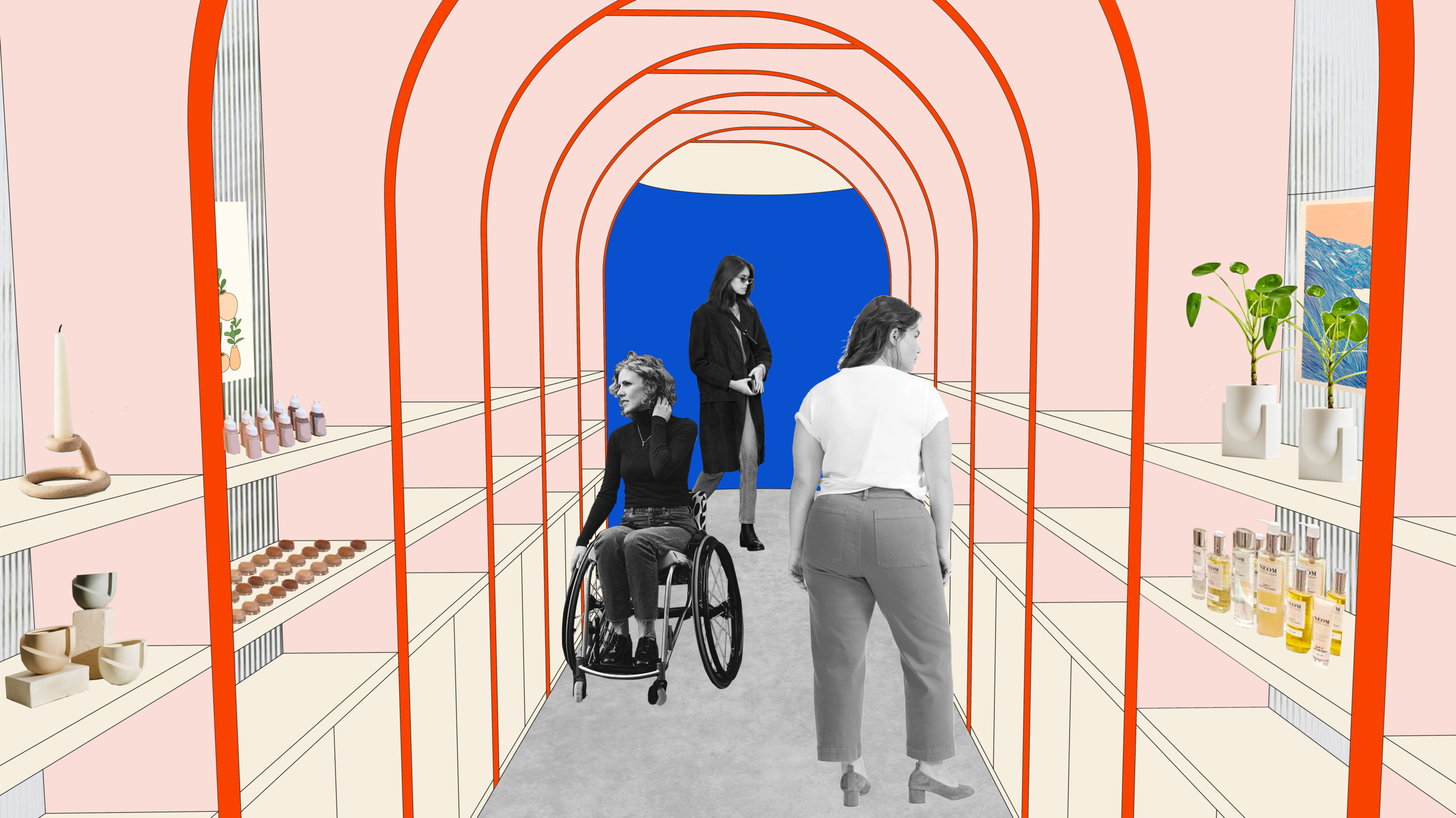
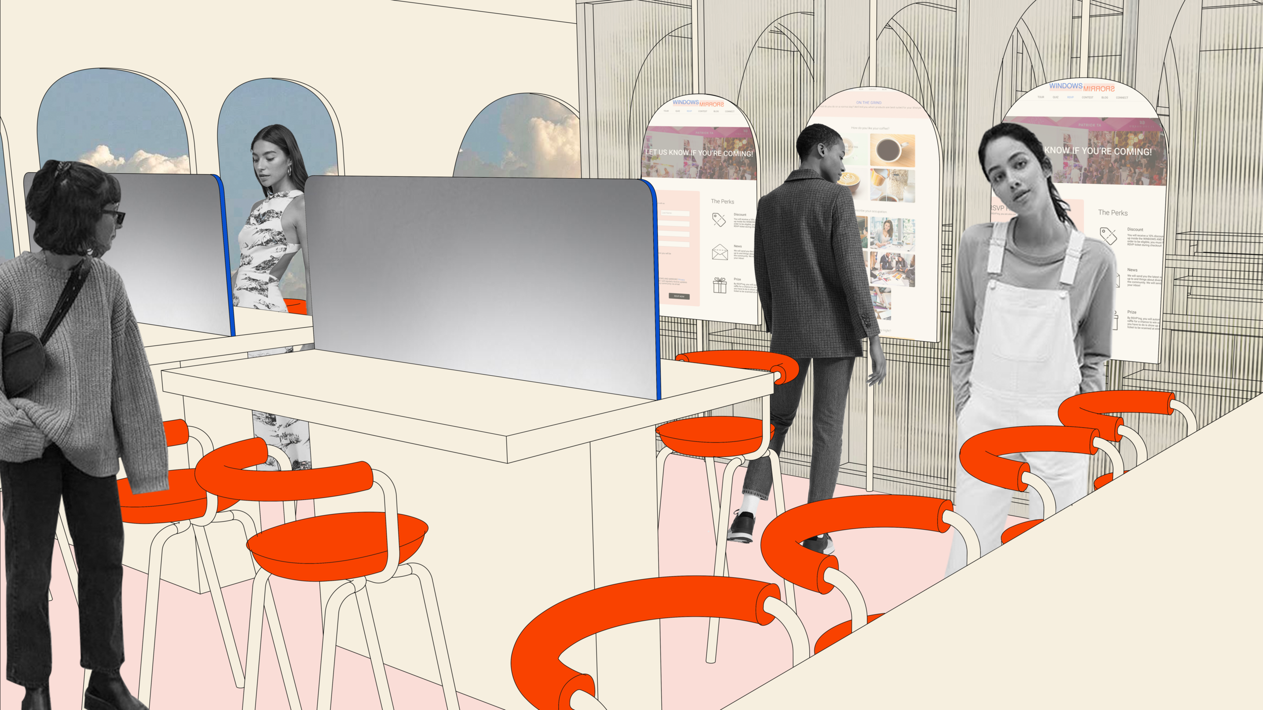
THE 40’x40’ ACTIVATION
An immersive exhibit and social media playground.


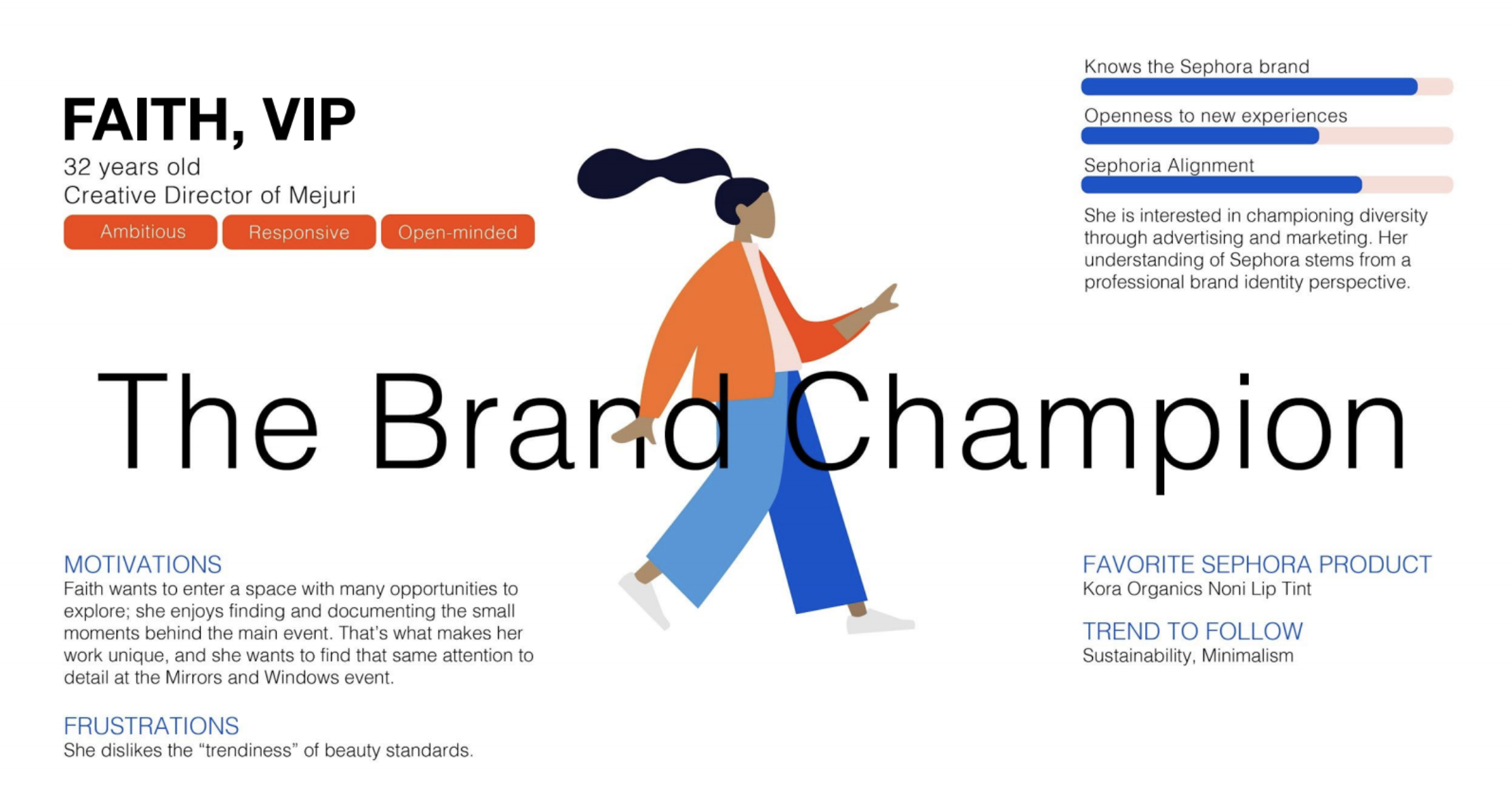
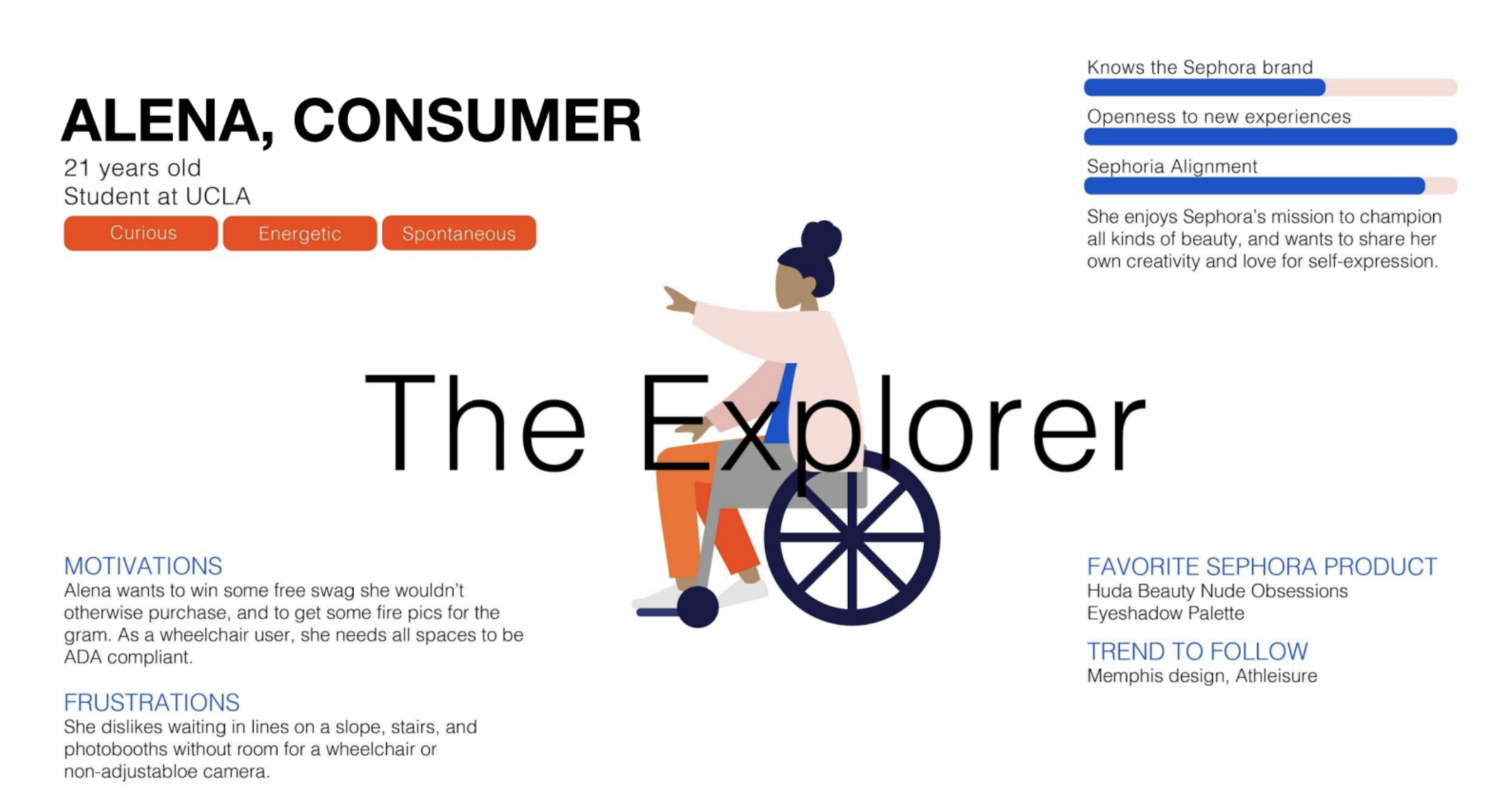
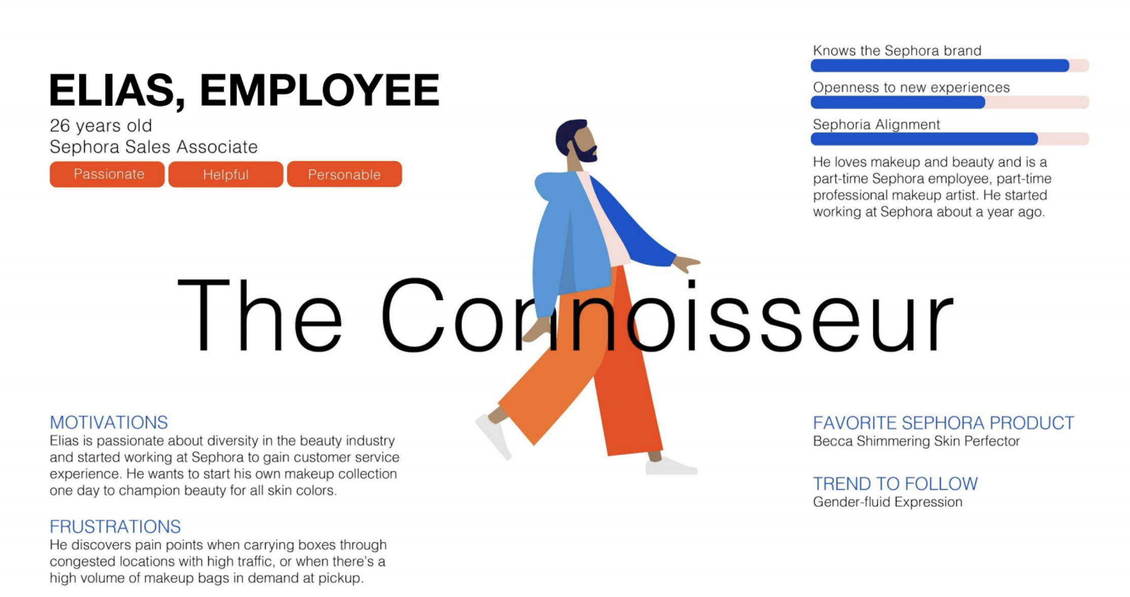
USER-FOCUSED DESIGN
Personas act as an example of types of people who would interact with the space. A deep dive into personas make our design more sensitive to their needs, motivations, and frustrations. We use these considerations to inform our design.
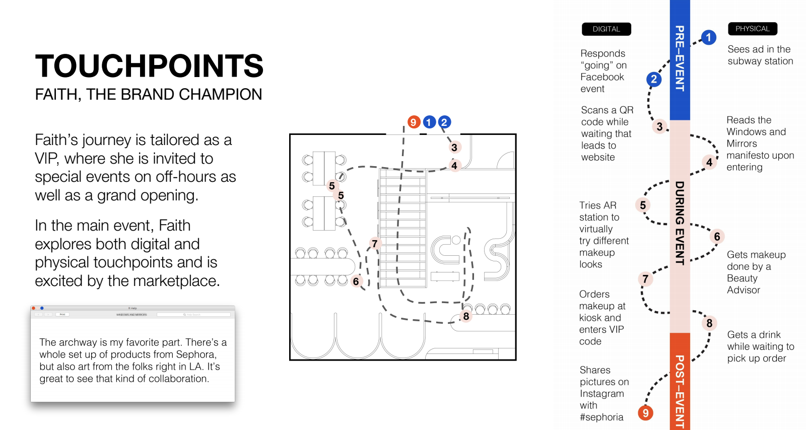
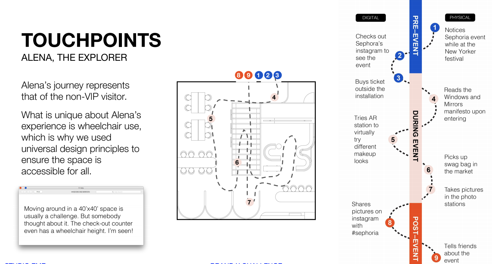
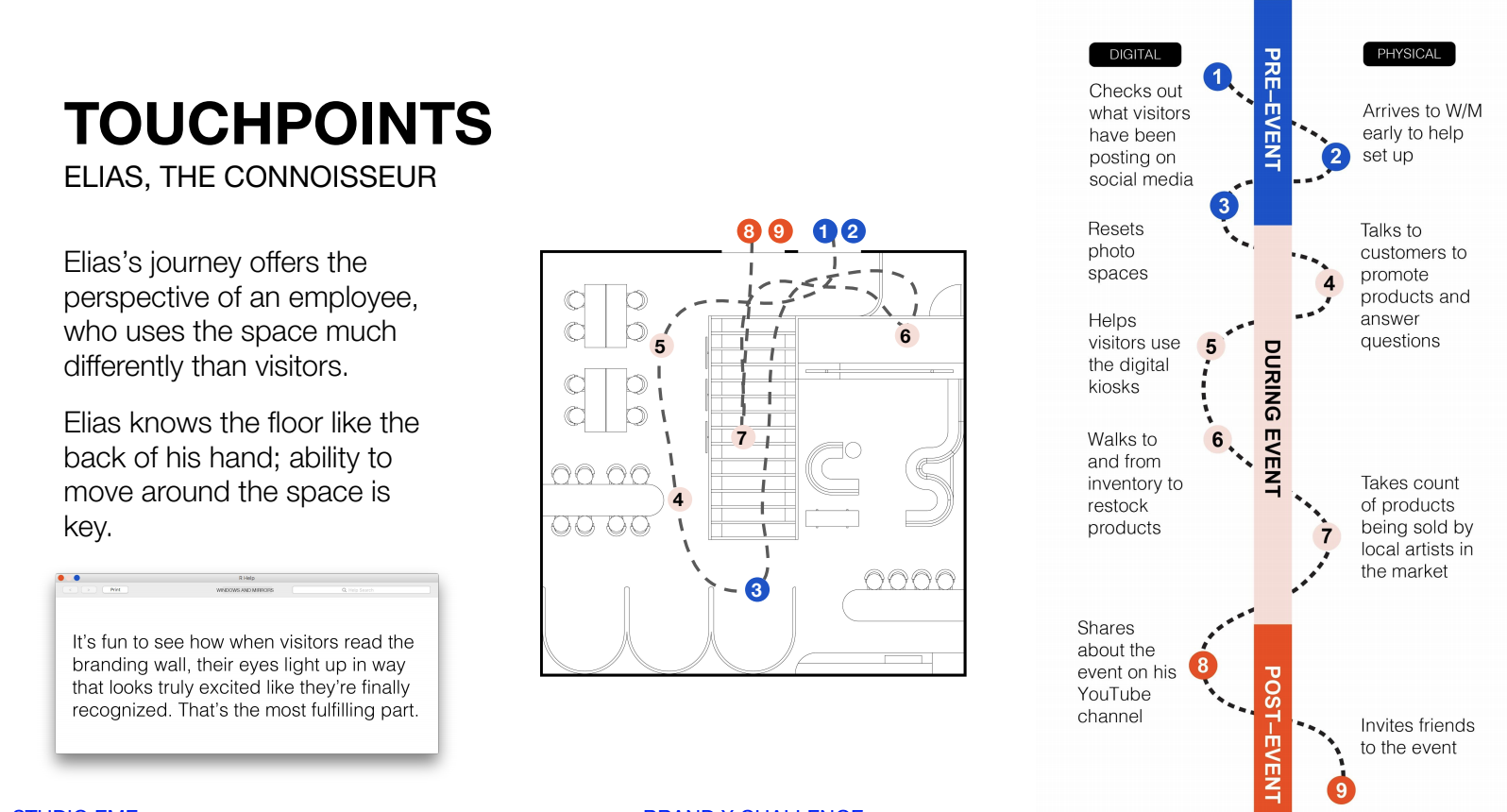
END-TO-END JOURNEY MAPPING
Touchpoint diagrams and storyboarding show careful considerations for the users’ experience in Windows and Mirrors. These are useful to ensure that the floor plan layout allows for smooth circulation and provides the optimal visitor experience
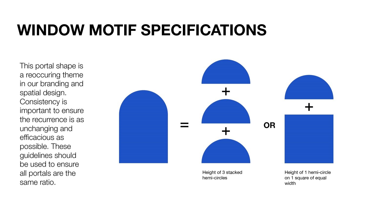
BRANDING PACKAGE
Our branding package consists of our color palette, logo specifications, and font choices to ensure the brand identity remains consistent throughout different applications.


DEEP DIVES
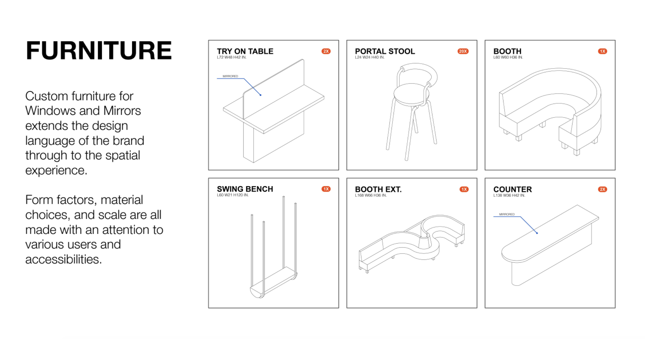
Within this 40’x40’ space, the narrative of Windows and Mirrors is clear. Visitors are encouraged to play, ask questions, and reflect on their own stories. The details of furniture, employee uniforms, F&B, and applied storytelling all work to strengthen the W/M identity.